Brand kit
The mark, and how to use it
Logo variants, colors, and type: the same small instrument that sits in the nav. Three data cells climb a diagonal, graded faint to solid.
Where the mark comes from
The three cells climb bottom-left to top-right, fill grading faint to solid. That grade is the same honest encoding the charts use: value carried by weight, not decoration.
- Container
- Superellipse · n 4.5
- Cells
- Three · graded fill
- Grid
- 32 × 32 units
- Encoding
- Weight = value
Every version of the mark
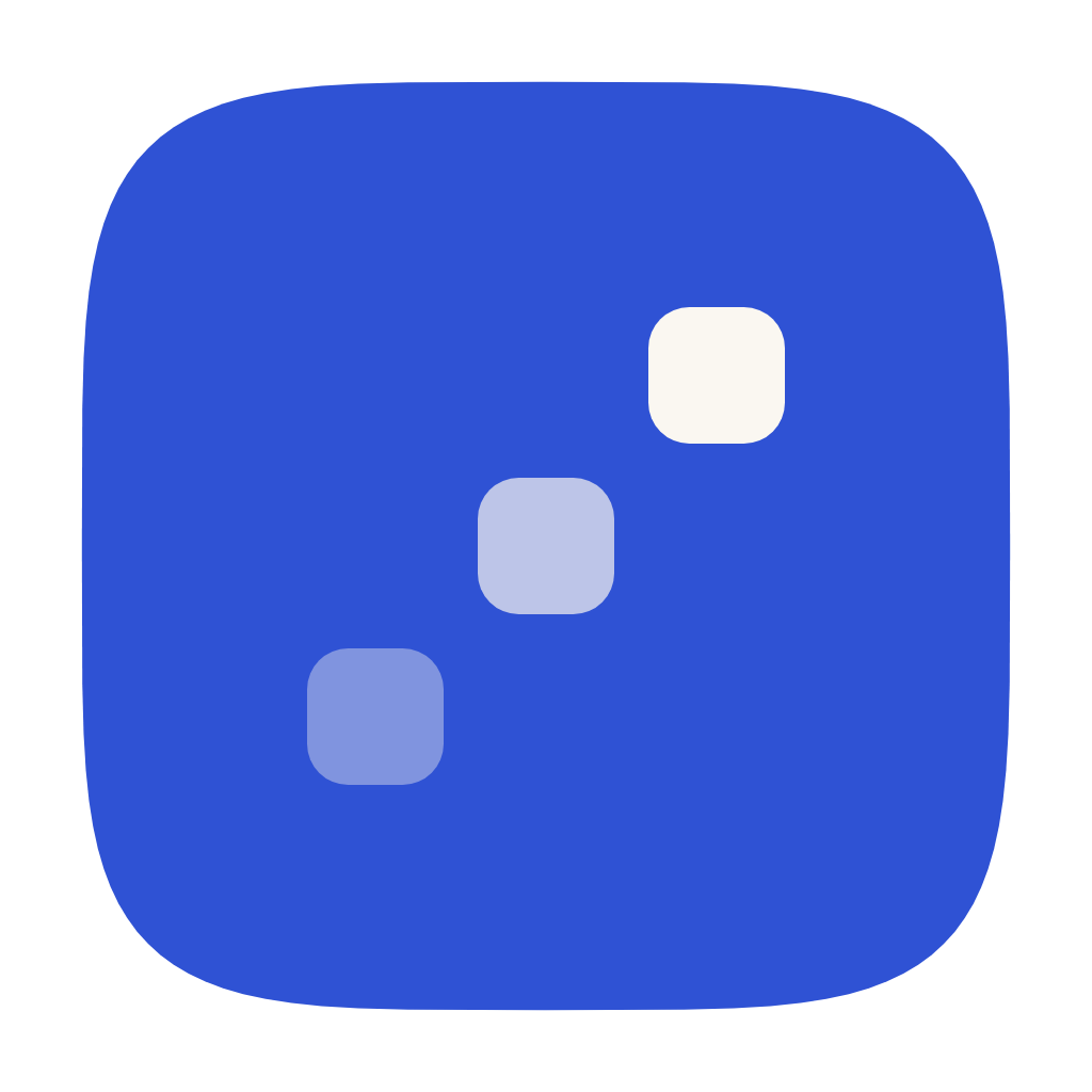
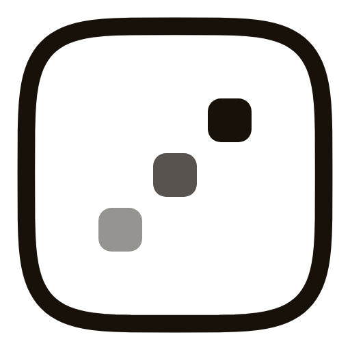
Cobalt is the primary one. There is a dark-theme cobalt, an adaptive version for hosts that flip theme, two mono inks for when color is not available, and two accent siblings. Every file below is the asset that ships under /brand.





The lockup, and the name alone
The lockup holds the mark at 1.375× the type size with a 0.625 em gap — the same proportions this site’s nav uses. The name is set in Open Runde 600 at −0.016 em and shipped as outlines, so it renders correctly on a machine that has never installed the font.















Clear space and minimum size
Keep at least one cell-width of air on every side, and don’t render the mark below 16 px, where the grade between the cells stops reading.
dashed field = reserved space
The SVG scales cleanly above 16 px to any size. Prefer the adaptive mark when the host theme can flip.
What not to do with it
The grade across the three cells is an encoding, the same kind the charts use. Every one of these breaks it.
Recolor the cells
Invert fills
Rotate
Stretch
Add effects
Reflow the grid
Six accents, one token
One token drives the chrome, the links and the chart emphasis. Cobalt is the default and the other five swap in from the picker in the nav. Click a chip to copy its hex.
Neutrals
Semantic, never color alone
The four typefaces
Display for titles, grotesk for reading, mono for measurement, and a serif for the one place the site sets prose as prose. Same four as the rest of the site.
Titles, section headings, the footer wordmark.
Prose, controls, everything read at length.
Labels, sizes, coordinates, snippets.
The home page, where it depicts written prose.
Writing the name
Always “microcharts,” even at the start of a sentence. Never MicroCharts, micro charts, or µcharts.
- The mark may pair with the wordmark or stand alone.
- Don’t redraw the wordmark. Take lockup.svg.
- Name
microcharts- Package
@microcharts/react- Install
pnpm add @microcharts/react
What the kit is for
Use it to link to or reference microcharts: a “built with” badge, a talk slide, an integration. Don’t modify the mark, use it as your own product’s mark, or imply endorsement. The code is MIT; the artwork is not, and LICENSE.txt carries its terms. Questions? @ganapativs.